I knew that if I was serious about trying to create a short film which was either completely surrealist or had inspiration from surrealism I was going to have to research and gain a good knowledge of what I was dealing with. The Dadaist and Surrealist movement seemed to be a good place to start.
Dada began as an anti art movement or more simply a movement against the way art was appreciated by the 'civilised world'. Surrealism was much more than an art movement. Dada and surrealism helped to change the modern consciousness.
Surrealist art is often referred to as a political statement. Artists were responding to the world they lived in and expressing horror and discomfort. Surrealists often tried to portray reality as a fictional reality of itself. Dadaism was considered one of the most dramatic and unique surrealist movements in the history of the development of art. The Dadaist movements developed out of political unrest, class struggle and social confusion. The movement began at the end of world war one, its said Dadaists were shaped by the destruction and pain of war, they wanted to prove the pointlessness of war to society. Dada was christened in Zurich in 1916. Richard Huelsenbeck claimed that he found the word in an old french dictionary its meaning- 'Hobby Horse'. He said that this proved that "art was as primitive as a childs toy" For the first few years the Dadaist movement was seen as an offering to the possibilities of a new art form. It all changed in 1918 when Picabia arrived in Zurich. Some described meetings with him was like shaking hands with death, his ideas were that emotionally and intellectually powerful.
After WW1 Germany was also influenced by the Dadaist movement. The German people were angry, hungry, alienated and receptive to anything that illustrated the futility of their existence. Because of this it gave birth to the first international Dada fair in 1920 as a salute to the changing movement in Russia.
Dadaism was short lived however. 1922, Paris the movement came apart because of conflicting values in members. Surrealism followed with a flair that differed from original Dadaist movement, Surrealists and dramatics believed that the best way to expose societies downfalls was to show it in outlandish extremes. The movements existed through the 1960's by this time the movement had many books and associated with Trosky and other political innovators, making a fundamental change to social systems.
Friday, 13 July 2012
Inspiration: Un Chien Andalous.
 I have been doing a lot of thinking about what I could do for my short film since the end of my AS project. I am very happy with what I produced at AS, however now I really want to push the boundaries of film. I recently was told to watch "Un Chien Andalous" by Spanish director Luis Bunuel and artist Salvador Dali. Although it was extremely shocking and surrealist, I found it memorising and began to get many ideas to perhaps include in short film of my own. I found out that in surrealism the director would often open the film, or play with something shocking. In the case of Un Chien Andalous this was in the form of a girl getting her eye slit open.
  Although this was an incredibly shocking image, it really drew me in as an audience member and I was intrigued as to what meaning was actually behind this. Other shocking images included ants crawling out of a mans hand and a hand that had been cut off just lying on the road.
 Although some may see it as madness I was just inspired and I wanted to delve deeper into the surrealist movement to try and understand the motives behind what Dali and Bunuel were thinking.
Looking at Magazines.
 When flicking through various film magazines, such as Empire and Total Film it becomes apparent that how these magazines really do make they're money.
For example looking through Total Film the lay out is extremely fragmented, concerning the reviewing of films. The films either get a 2 page spread or half, or mini snip-its, there is never just a one A4 page with a review on it.
I questioned why this was and realsed that where there is a spare single page, this is where they have the advertising for things such as home cinema Jack Daniels. These are how the film magazine market really make they're money. Also seemingly the films that have the large double page spread are the huge block busters, such as Kings Speech, Bridesmaids and Water for Elephants. Seemingly as well as these being the large mainstream block busters, they also have well known actors in. Its been proven that when looking for a good film to watch, the majority of audiences will look at the actors, and make their decision as to whether to watch it from that. This is why film magazines and poster makers often use the actors name or a huge picture to lure in the audiences. This is all well and good, however none of this leaves much room for the smaller films and the more unknown actors. In magazines such as Total Film, they have a number of double page spreads with tiny reviews, fitting about 14 on a double page. There's a tiny blurb about the film and then the generic star system that we all recognise. To me, this seems a bit odd and backwards. Surely if a film is less mainstream, more left wing and has new actors in, they need a larger space to lure in audiences, otherwise they will just be looked over by the Hollywood blockbusters. Because there isn't a great amount of information about the film, people may be swayed against watching it. This causes more individual film makers to be stuck in a rut, if the larger films are being splashed across these prestigious film magazines,then the littler ones are being pushed aside.
When flicking through various film magazines, such as Empire and Total Film it becomes apparent that how these magazines really do make they're money.
For example looking through Total Film the lay out is extremely fragmented, concerning the reviewing of films. The films either get a 2 page spread or half, or mini snip-its, there is never just a one A4 page with a review on it.
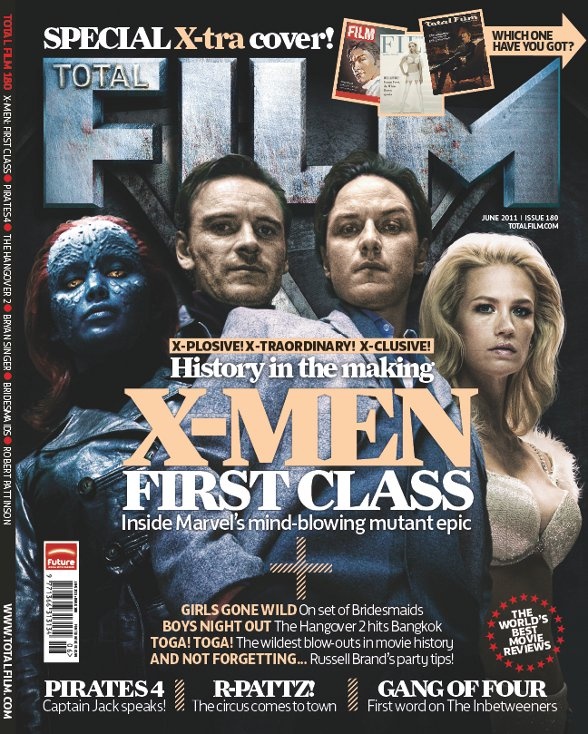
I questioned why this was and realsed that where there is a spare single page, this is where they have the advertising for things such as home cinema Jack Daniels. These are how the film magazine market really make they're money. Also seemingly the films that have the large double page spread are the huge block busters, such as Kings Speech, Bridesmaids and Water for Elephants. Seemingly as well as these being the large mainstream block busters, they also have well known actors in. Its been proven that when looking for a good film to watch, the majority of audiences will look at the actors, and make their decision as to whether to watch it from that. This is why film magazines and poster makers often use the actors name or a huge picture to lure in the audiences. This is all well and good, however none of this leaves much room for the smaller films and the more unknown actors. In magazines such as Total Film, they have a number of double page spreads with tiny reviews, fitting about 14 on a double page. There's a tiny blurb about the film and then the generic star system that we all recognise. To me, this seems a bit odd and backwards. Surely if a film is less mainstream, more left wing and has new actors in, they need a larger space to lure in audiences, otherwise they will just be looked over by the Hollywood blockbusters. Because there isn't a great amount of information about the film, people may be swayed against watching it. This causes more individual film makers to be stuck in a rut, if the larger films are being splashed across these prestigious film magazines,then the littler ones are being pushed aside.  Also there is a huge question mark over the honesty when it comes to reviews. For example, the June 2011 issue there is a huge double page spread of the review of Kings Speech; Colin Firths face along with Helena Bonham Carter and Geoffrey Rush, these are all extremely established people in the film world. If the writer of the review (Neil Smith) were to rate the film 2 Stars, or something low down on the star scale and write and awful review, then the film company would be extremely hesitant as to let they're film be reviewed by Neil Smith, or Total Film Magazine. This would put the magazine in danger, and no doubt make them lose a large amount of money. Similarly if they were to write a bad review about Colin Firth, combined with having his face splashed across the pages of their magazine. This wouldn't go down to well either.
 Friday, 6 July 2012
Working With Photoshop.
Technology seems to be everything in our current media environment, whether its from CGI or just using photoshop, with out it films seem aged and unprofessional. So with this in mind I knew that I had to gain skills of a certain standard so that my film poster looked convincing.
And after a lot of editing I ended up with this:
 I wanted to create something quite abstract so that I had used all the possible skills that I would need when it came to making my film poster. I layered things, cut things and changed that colour.
The next thing to think about was creating a film poster and how they lo0k. I chose a film that i knew really well, Moulin Rouge. I also knew that there were many iconic images within Moulin Rouge; from the famous windmill to the two protagonists singing etc.
I also looked at some of the previous film posters, to see if I was able to encourparate anything, or get any ideas:

 Interestingly the second of the two posters I focused on used the idea of grids. Something we got told about after my initial research. On photoshop, and when creating posters in general, not just film posters grids are used so that the maker can see how the poster will be split up.
This is my final Moulin Rouge poster:

I also wanted to experiment with text, as when doing my Moulin Rouge poster I found it hard to find colours that could be seen. I found a simple picture of Black Swan and tried to experiment with effects and ensuring the writing was visible:

We had a workshop where we just had to put images together.
I started with these images:


And after a lot of editing I ended up with this:

The next thing to think about was creating a film poster and how they lo0k. I chose a film that i knew really well, Moulin Rouge. I also knew that there were many iconic images within Moulin Rouge; from the famous windmill to the two protagonists singing etc.
I also looked at some of the previous film posters, to see if I was able to encourparate anything, or get any ideas:
Interestingly the second of the two posters I focused on used the idea of grids. Something we got told about after my initial research. On photoshop, and when creating posters in general, not just film posters grids are used so that the maker can see how the poster will be split up.This is my final Moulin Rouge poster:

I also wanted to experiment with text, as when doing my Moulin Rouge poster I found it hard to find colours that could be seen. I found a simple picture of Black Swan and tried to experiment with effects and ensuring the writing was visible:

Subscribe to:
Posts (Atom)