Tuesday 29 January 2013
Monday 28 January 2013
Audience Response
Obviously a key part of any film is ensuring that the audience understands the meaning and concept behind the film. After airing our rough cuts each member of the class had to write a summary in two sentences or less describing what the short film was about. I was slightly worried because it occurred to me that my actual concept is quite long winded and complex and seeing as my film has limited dialogue and actual footage of acting, I wasn't sure how the audience would interpret what was going on.


Here's what people thought:


I was incredibly surprised to find out that the majority of people did actually pick up on the message behind my film. This and my feedback gained has given me the confident to go and tweak certain aspects to try and fill in the gaps and make the whole thing better!
Feedback

 After showing our rough cuts to a group of people, we were given the sheets of feedback that they'd written. This was a really helpful tool because after working on my film for such a long time, you begin to get far too familiar with it and miss out imperfections etc. It was really good to have a fresh pair of eyes watch and give their own opinion. These are some of the comments I recieved:


I got all Level 3's in my peer marking, which I am really happy with. However I am definitely going to take on board as many of the comments as I can.
I am now considering having some music over certain parts of my film because after receiving this feedback and watching other peoples short films music is such a good emotive tool and I hope my piece is quite emotive. So maybe having some music would push that through even more.
I am slightly concerned about some of the comments about the lack of footage because the reason I left footage with actors in minimal was because I wanted to create something a little bit different. However I will think about what I can do and if I can add in anything else.

Wednesday 23 January 2013

Tuesday 22 January 2013
Monday 21 January 2013
Sunday 20 January 2013
Monday 14 January 2013
Photoshop work so far..

The centre that's been rubbed out is where I want to layer an image underneath, however I am undecided as to what I'm going to put in. Ive thought about putting some old fashioned books on one side and having them merge into the plastic folders we now use to store our work at school. This would be to emphasise the change in society, the education system, time and the government. This would help to reinforce the fact that in my film I'm trying to display a difference in time, as it begins with interviews with Princess Diana from the early 90's and then a quote from Tony Blair, in the mid 90's to early noughties who of course was leader of the labour party, then the quote about David Cameron at the end our current Prime Minister, who of course is a Conservative. So if I was able to merge two connecting images together this would really aid my film. Its just choosing my images is the tough bit.
Obviously I am aware that the most important thing is the titling, I'm hoping that by putting the white on top of the black stripes makes the title more prominent. Also like I said in earlier in the absence of images I'm using my tag line to evoke curiosity.
Screenshot images


However I thought it would be interesting to explore what the images are that I would use if I was going to add them to my film poster.
I watched my film and the most emotive shots I have are shown to the left, I think its important to
have the images capturing the emotion because this doesn't give to much away, however it leaves the audience being curious about how the character got the point and what has happened and so on.
Although, I'm pretty sure I wont be using these images!
Potential images for my film poster
 If I do choose to go with using a school blackboard as my background image then obviously I had to use an original image. It was actually a lot harder trying to find a blackboard then I originally thought it would be, there werent any at school and I thought we had quite a big one at home, however all I could find was this small one. Im hoping that it will be okay to use once photoshopped, and cropped etc!
If I can I want to try and blurr out some of blackboard and layer an image behind it. This will signify the corruption theme within my film. However i'm not sure what image to use yet.
Friday 11 January 2013

Radio Times
Although of course the Radio Times isn't specifically a film magazine at all. Its main purpose is to list the radio and television listings for the week. It was originally commissioned by the BBC which meant any articles had to be unbiased and 'politically correct' however it then later merged into the Intermediate Media Company.


 My family and I religiously purchase the Radio Times every week, and although arguably its main audience is more the middle aged, I actually find the articles it has to offer very interesting.
Every week films that are being currently shown on television over that next week are reviewed in different styles, since the technology has revolutionised and there are now thousands of TV channels obviously not every film can be reviews in depth. Often the Radio Times has a short paragraph reviewing the film, it just gives the reader and articulate, pithy response helping them choose whether or not they should watch the film or not.
Also the Radio Times often does full articles on current films. Just yesterday I was reading an article about the new Les Miserables film, the review isn't specific to the technological language and specialist terms which can be found in Sight and Sound magazine. It takes more of a casual conversation tone, focusing on the actors and locations, things that are more likely to interest a 'normal' person ( someone that doesn't have an intricate knowledge of film). In a review like this it really varies how much space they take up, sometimes they focus more on the image than the writing, or vice versa.
When thinking about my own magazine review I like how versatile and varied the structure of the reviews can be, and there never seems to be a 'bitchy' or 'cut throat' feeling about them. The language is descriptive yet pithy. It just seems well written, and aimed at an audience that doesnt need to be dummed down, yet we dont need a thesaurus to read it. It has a nice family, almost cosy feel, rather than magazines that are specifically focused to film such as Empire.
My family and I religiously purchase the Radio Times every week, and although arguably its main audience is more the middle aged, I actually find the articles it has to offer very interesting. Every week films that are being currently shown on television over that next week are reviewed in different styles, since the technology has revolutionised and there are now thousands of TV channels obviously not every film can be reviews in depth. Often the Radio Times has a short paragraph reviewing the film, it just gives the reader and articulate, pithy response helping them choose whether or not they should watch the film or not.
Also the Radio Times often does full articles on current films. Just yesterday I was reading an article about the new Les Miserables film, the review isn't specific to the technological language and specialist terms which can be found in Sight and Sound magazine. It takes more of a casual conversation tone, focusing on the actors and locations, things that are more likely to interest a 'normal' person ( someone that doesn't have an intricate knowledge of film). In a review like this it really varies how much space they take up, sometimes they focus more on the image than the writing, or vice versa.
When thinking about my own magazine review I like how versatile and varied the structure of the reviews can be, and there never seems to be a 'bitchy' or 'cut throat' feeling about them. The language is descriptive yet pithy. It just seems well written, and aimed at an audience that doesnt need to be dummed down, yet we dont need a thesaurus to read it. It has a nice family, almost cosy feel, rather than magazines that are specifically focused to film such as Empire.
Wednesday 9 January 2013
Film posters say more about the actors/characters than we think..
There are undoubtedly some actors that we categorise playing certain parts e.g Colin Firth playing the English gentleman having some sort of awkward affair with a woman, or Helena Bonham-Carter playing a crazy woman (obviously there are some exceptions). One of the key conventions of a movie poster is to inform the audience of what the film is about, and what the characters are like and the genre of the film.
I've done some research into the same actors in different films and there are some hilarious comparisions. I found the lack of imagination of some of the poster designs in some of the top Hollywood films.
It was the case that in the old days where Hollywood cinema starring Judy Garland and Marilyn Munroe that the production companies actually owned the stars, therefore there way of advertising was by plastering the names or pictures of the stars all over their film posters. This seemed fair, if you have the likes of Marilyn Munroe in your film you may aswel show off your assetts.
However it seems now-a-days that there are only about 10 actors in the world, and in every film poster they seem to be doing the same thing:
Colin Farrow is always staring into the corner of the poster....


Jim Carrey has an extravigent expression on his face and very flexible arms!


Johnny Depp doesn't appear to like the top of his head..


Jennifer Anniston is always with a man and looking very glum..


Looking at these posters has made me realise that its not hard to create an eye catching poster, Personally I didnt want to have any actors on my posters because I dont like that way big Hollywood blockbusters drive the sales of their films by utilising the actors fame.
I've done some research into the same actors in different films and there are some hilarious comparisions. I found the lack of imagination of some of the poster designs in some of the top Hollywood films.
It was the case that in the old days where Hollywood cinema starring Judy Garland and Marilyn Munroe that the production companies actually owned the stars, therefore there way of advertising was by plastering the names or pictures of the stars all over their film posters. This seemed fair, if you have the likes of Marilyn Munroe in your film you may aswel show off your assetts.
However it seems now-a-days that there are only about 10 actors in the world, and in every film poster they seem to be doing the same thing:
Colin Farrow is always staring into the corner of the poster....
Jim Carrey has an extravigent expression on his face and very flexible arms!
Johnny Depp doesn't appear to like the top of his head..
Jennifer Anniston is always with a man and looking very glum..
Looking at these posters has made me realise that its not hard to create an eye catching poster, Personally I didnt want to have any actors on my posters because I dont like that way big Hollywood blockbusters drive the sales of their films by utilising the actors fame.
Film Poster Fonts..
In my previous research I have delved into what makes a good film poster, and one of the main things was an eye catching font, which is clear for the audience to read and understand.
Avatar's huge budget of 150 million dollars, and the hype over the revolutionary special effects and graphic design you would expect the poster to be flawless. If a production company has all this money to throw at an advertising campaign, then you would think they would utilise all their sources to the maximum. I'm not slating the design of the actual Avatar poster, because in most parts it has the right conventions, but after researching on the Internet many people have a problem with the font that has been used.
 The font is said to be "Papyrus". Its speculated that there are two fonts that are universally hated by designers and these are 'Comic Sans' and 'Papyrus'.
To the eye of the normal person, and even myself wouldn't notice unless I couldn't actually read the title. However I just found it very interesting that just the use of the font has caused a huge controversy between graphic designers. This reinforced my thinking into my own font, which is something I haven't really thought about in great detail. Luckily personally I find fonts like 'Comic Sans' incredibly annoying too so that wont find itself anywhere near my poster.
In my film i've used a lot of writing already, so I planned to use the same font to try and tie it in together. The font is Courier New, its not a font I would normally use, however I wanted it to look like a old fashioned type writer had written it. I'm currently unsure as to whether i'm going to use this font in the poster, or perhaps have the writing looking as if it's been written by hand. However my photo shop skills will have to be brought up to scratch.
Avatar's huge budget of 150 million dollars, and the hype over the revolutionary special effects and graphic design you would expect the poster to be flawless. If a production company has all this money to throw at an advertising campaign, then you would think they would utilise all their sources to the maximum. I'm not slating the design of the actual Avatar poster, because in most parts it has the right conventions, but after researching on the Internet many people have a problem with the font that has been used.
To the eye of the normal person, and even myself wouldn't notice unless I couldn't actually read the title. However I just found it very interesting that just the use of the font has caused a huge controversy between graphic designers. This reinforced my thinking into my own font, which is something I haven't really thought about in great detail. Luckily personally I find fonts like 'Comic Sans' incredibly annoying too so that wont find itself anywhere near my poster.
In my film i've used a lot of writing already, so I planned to use the same font to try and tie it in together. The font is Courier New, its not a font I would normally use, however I wanted it to look like a old fashioned type writer had written it. I'm currently unsure as to whether i'm going to use this font in the poster, or perhaps have the writing looking as if it's been written by hand. However my photo shop skills will have to be brought up to scratch.
Original Movie Posters
 Definition: A poster that was issued for a movie by the National Screen Service (NSS) or by the movie studio or by any of the other company authorized by the studio for the display in an actual movie theatre at the time of the original release.
 There are also "Studio Issued" original posters, these are printed at the same time as theatrical display posters, although they werent actually meant for theatrical display they are still considered original. They were distributed to the "insiders" and those who worked on the film.
Often people confuse DVD posters as they original posters, these are not. These are just purely to adverstise the release of the DVD etc. They may have the same value as original movie posters to some people because they have been released at the same time as the release of the film. Some of them can be quite collectable and valuable, but mostly not.
There are cases that original movie posters can be incredibly valuable and be worth a lot of money. This certaintly isnt the case for reproduction posters.
Tuesday 8 January 2013
Empire Magazine
If we look at the front cover shown above this magazine doesnt actually really resemble that what you would imagine a film magazine to look like. There's a picture of Katy Perry splashed across the front, who is undoubtedly a sex symbol. At first glance is looks a little more like a mans magazine, however this is contradicted slightly by headlines such as "Guilty Pleasures" which makes one think of woman's magazines such as cosmopolitan etc. But so far, after looking at first glance there isn't really much hint of it being a magazine about film.
Its only until one reads the subheadings and headings that you get the idea of what the magazine is actually about. The use of the provocative image of Katy Perry is a very good marketing ploy to entice readers that wouldnt usually read this magazine, woman want to be like her, men want to be with her. It's an interesting concept and it highlights that fact the magazine is aimed more at the mainstream audiences, with a hint of mainstream plus and maybe a few afficienado's, in any case the magazine is for everyone.


In earlier posts I showed how the sight and sound magazine has a double page spread pretty much filled with writing. In Empire magazine it vary's the way it presents its reviews, sometimes they do shorter more snappy reviews, but then again sometimes they are longer, more detailed and intricate. This again compliments the way that Empire magazine tries to appeal to a wider audience. As shown in the picture above on the right hand side, the review is still a double page spread, however there is a big picture and the writing is broken up with other little subheadings and so on.
One of the main strengths of Empire Magazine is that it appeals to such a wide audience, there is something in there for everyone whether you have a expert knowledge of film or you just want to know whether you should see a film or not.
Where movie posters have gone wrong..
We've already explored the impact of film posters, undoubtly we cant really escape them and like i mentioned, unless you have an intricate knowledge of the conventions of film posters, most of the time you dont look that closely that the quality. However, there have been some cases even over the past year that you just cannot disregard the poor quality of these film posters.
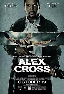 This film got incredfibly bad reviews, so the fact the film poster is not up to scratch isn't surprising. Tyler Perry's face is completely unreadable, we can't tell at all his emotion or feeling. Also Matthew Fox seems to serve no purpose, he just look like he's been plastered in there for no reason. The workmanship is extremely sloppy and it doesnt appeal to audiences at all.
  This films genre is actually comedy, and you just wouldnt know it from this film poster. Also the photoshop is very poor and outdated, considering the amazing, revolutionary technolody we have this just looks shoddy. The poster leaves nothing to the imagination, it practically gives away whats going to happen in the film, with the errupting volcano, characters running from monsters, the attractive girl and so on.
  It seems that everything looks incredibly forced. Clearly the production company is very aware that the title is only going to really appeal to woman. The bottom of the poster is clearly trying to appeal to men. Its trying to have some comedic appeal, but it displays irony more than anything which is actually just quite offensive. On the top image the photoshop is awful, all the woman are supposed to be in a room together, although its very obvious that these images have just been plastered together.
 Monday 7 January 2013
Key conventions of a film poster
- Eye catching for the audience
- Focal point drawing in audiences eye
- Title is clear, in large font
- Helps to define the genre of the film
- Designed to attract the largest audience possible
- Indication of release date of the film
- Information of director/production company/actors and so on
- Small review, star system
- Sometimes information about other films the company has made
Looking closer into Harry Potter and the Deathly Hallows P1 poster-

The first thing we notice when looking at this poster is what is happening in the picture.
The three characters are running, this suggests the genre of the film and that it has a lot of high energy in it. It also helps to add a bit of intrigue, audiences my wonder why are the characters running, are they running away from something, to somewhere...?
The picture shows the three main characters. It shows a little more emphasis on Harry, being the main character, he is the largest of the three and at the front.
There is use of a tagline just under the main title. This tagline is short and snappy, allowing audiences to remember it, also it adds more intrigue into what the film is going to be about.
The title is the largest text on the poster, it's clear and easy to read. It catches the audiences eyes, you cant look at the poster without noticing it.
The release date uses the word "epic", this is positive and persuasive language showing how important the film is.
The influence of a film poster..


Film posters now-a-days are so much more than a few pictures scrabbled together, with the actors name in large print to try and pull in the punters, undoubtedly they are hugely intricately thought out works of art. An astronomical amount of money is spent on creating film posters each year.Often it's the case that a film has many more than just one posters. There are different styles for different things, such as on tube stations and buses etc, this entices the audience, because at first glance they think that they're seeing something new, however it's just the same film with a slightly modified poster. This is very clever advertising.
It's often the case that the distribution companies will release a fairly plain version of the poster first, when I say plain I mean the picture being the forefront, then the title of the film, maybe a few of the actors names etc. Often they wont even put a date on it, it can often be left as "Coming Soon". This wets the consumers appetite, only leaving them wanting more.
The question is to what extent does the film poster, and the film poster alone influence a person's choice to see a specific film?
As a visual aid of course film posters are one of the most influential ways of effective marketing. We have come accustomed to seeing the latest movie blockbuster splashed across our tv's, magazines, bus stops and so on however I'm not sure that it's actually the film poster itself that influences a persons choice to see the film.
Don't get me wrong, if I saw a simple, badly designed, half hearted poster it would slightly curve my decision. However after doing a lot of research into how much time and money is spent on constructing the perfect film poster, i think it would only be film buffs and film poster buffs (if there is such a thing) that it would effect to any great level. I know personally that i'm not going to stand at a bus stop analysing the form of a poster.
Personally I believe that its more the quantity of times we see the poster. If everywhere we go we see the same or similar image over and over again, it leads us to believe that this film is going to be good. Clearly the film has put a lot of money in advertising, meaning they have a lot of money for other things within the film, generally meaning it's going to be a greater success. In our modern climate going to the cinema is a luxury for a lot of people and we need to be 100% sure that what we're investing our money in, is going to be good. If we've seen the poster of a film splashed across every surface, we're more inclined to see that film, rather than a plain looking poster in the back of a film magazine.
Subscribe to:
Posts (Atom)